Displaying Multiple Product Images in a Grid

With previous versions of TOWeb, the multi-image mode of a paragraph offered only two display modes:

  • A classic display with a main image and a selection bar of thumbnails beneath it for switching images.
  • An image carousel with a more or less rapid scrolling speed.

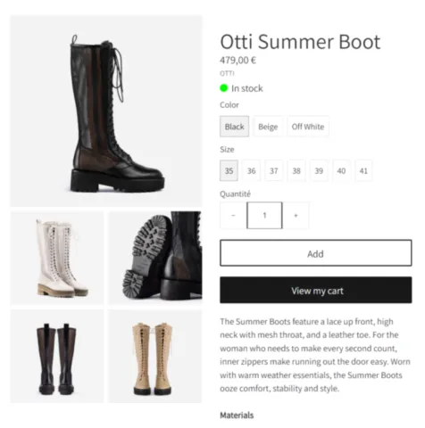
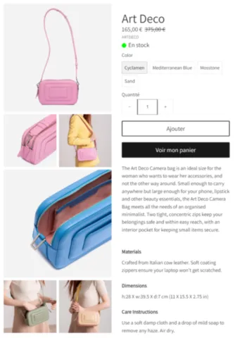
TOWeb version 13 introduces grid display modes that are particularly well-suited for product sheets on e-Commerce sites. Additionally, these display modes transform into modern carousels with swipe handling on smartphones, making your e-Commerce site much more user-friendly for customers!

Here is a presentation of the new available display modes, illustrated here with the "WAND" template. The selection of new "grid" display modes is possible on a paragraph with multiple images in TOWeb.
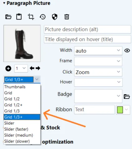
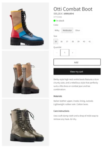
product image display modes

The "Grid" Mode

This mode displays images one below the other.

displaying products in grid mode

The "Grid 1/2" Mode

This mode displays the first image normally and the subsequent images in two columns.

displaying products in grid mode 1/2

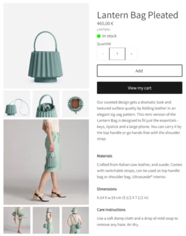
The "Grid 1/2+" Mode

This mode alternates between displaying one normal-sized image and the next two side by side.

displaying products in grid mode 1/2+

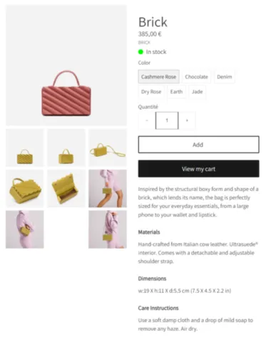
The "Grid 1/3" Mode

This mode displays the first image normally and the subsequent images in three columns.

displaying products in grid mode 1/3

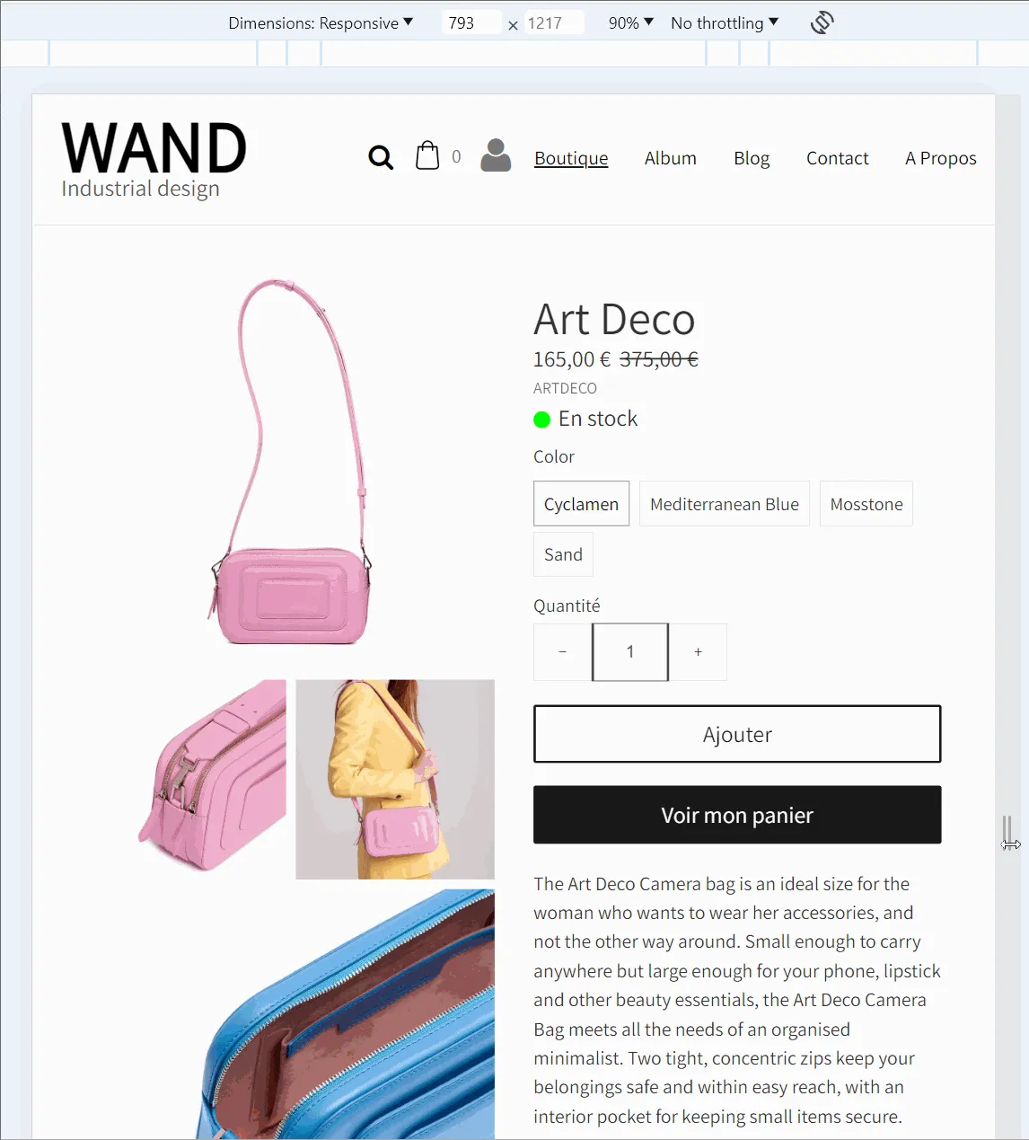
The "Grid 1/3+" Mode with alternation between 1 and 3 images

This mode alternates between displaying one normal-sized image and the next three side by side.

displaying products in grid mode 1/3+

Fonctionnement responsive adapté aux smartphones

Tous ces modes grilles se transforment sur smartphone en un carrousel moderne qui gère les swipes (défilements tactiles)

responsive display of products in grid


Page 12 of 38
Link copied to clipboard